REDUX
Entstanden im Sommersemester 2020 als Zwischenprüfungsprojekt an der Akademie für Illustration und Design Berlin.
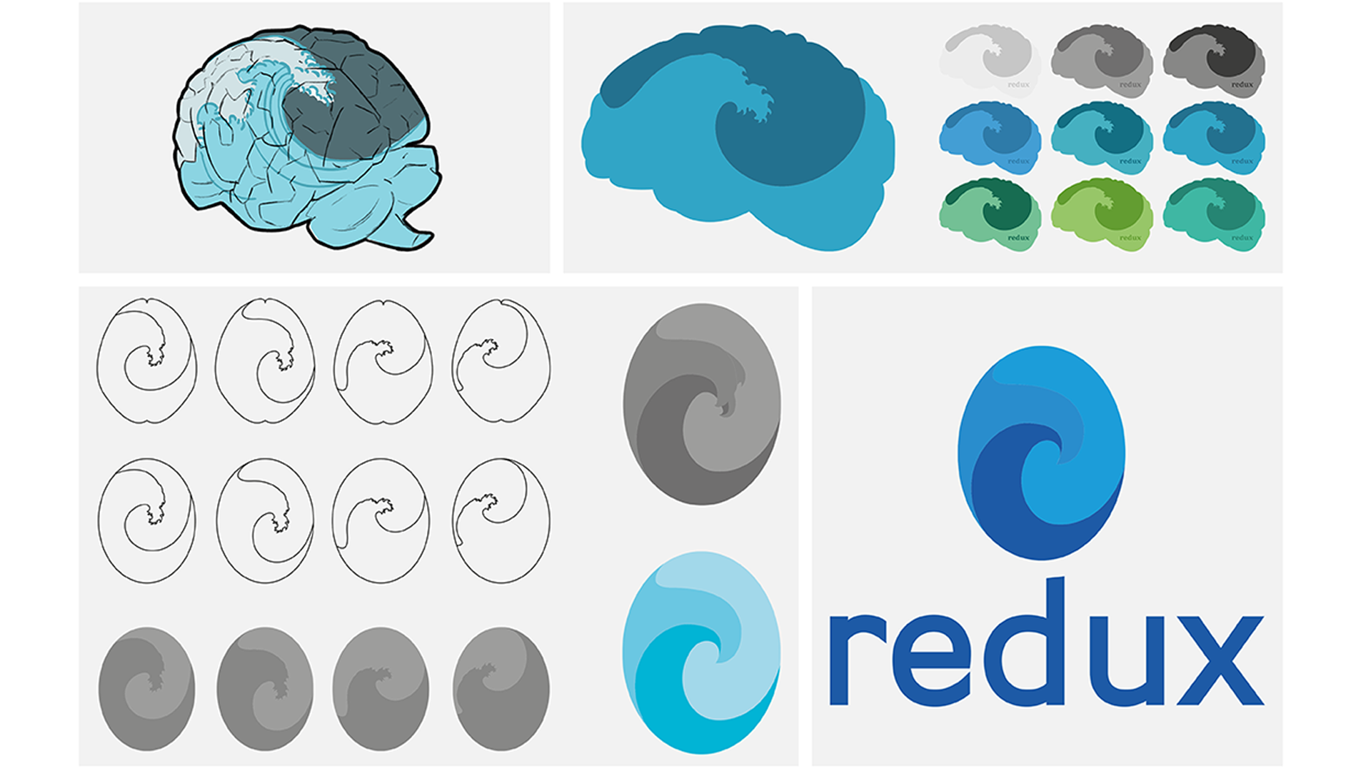
Ziel war die Entwicklung einer Wort-Bild-Marke, Package Design und Kampagne für ein fiktives Schmerzmittel der Firma REDUX. Entworfen für die Target Audience der Best Ager im modernen und edlen Design, mit Nachhaltigkeit, natürlichen Inhalten und der Entstigmatisierung von Medikamenten als USP.
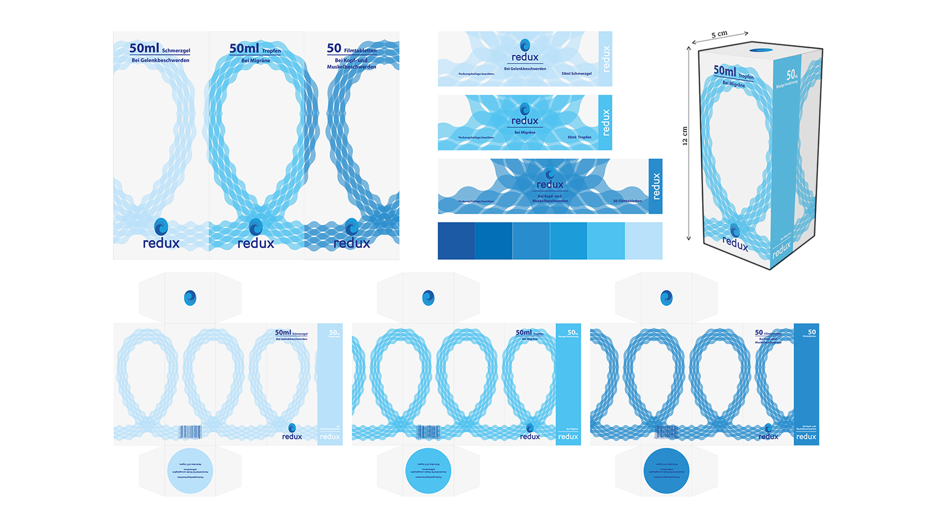
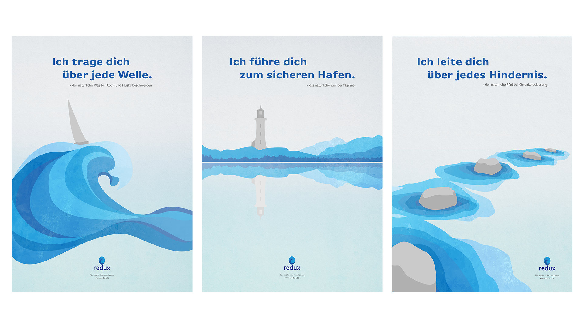
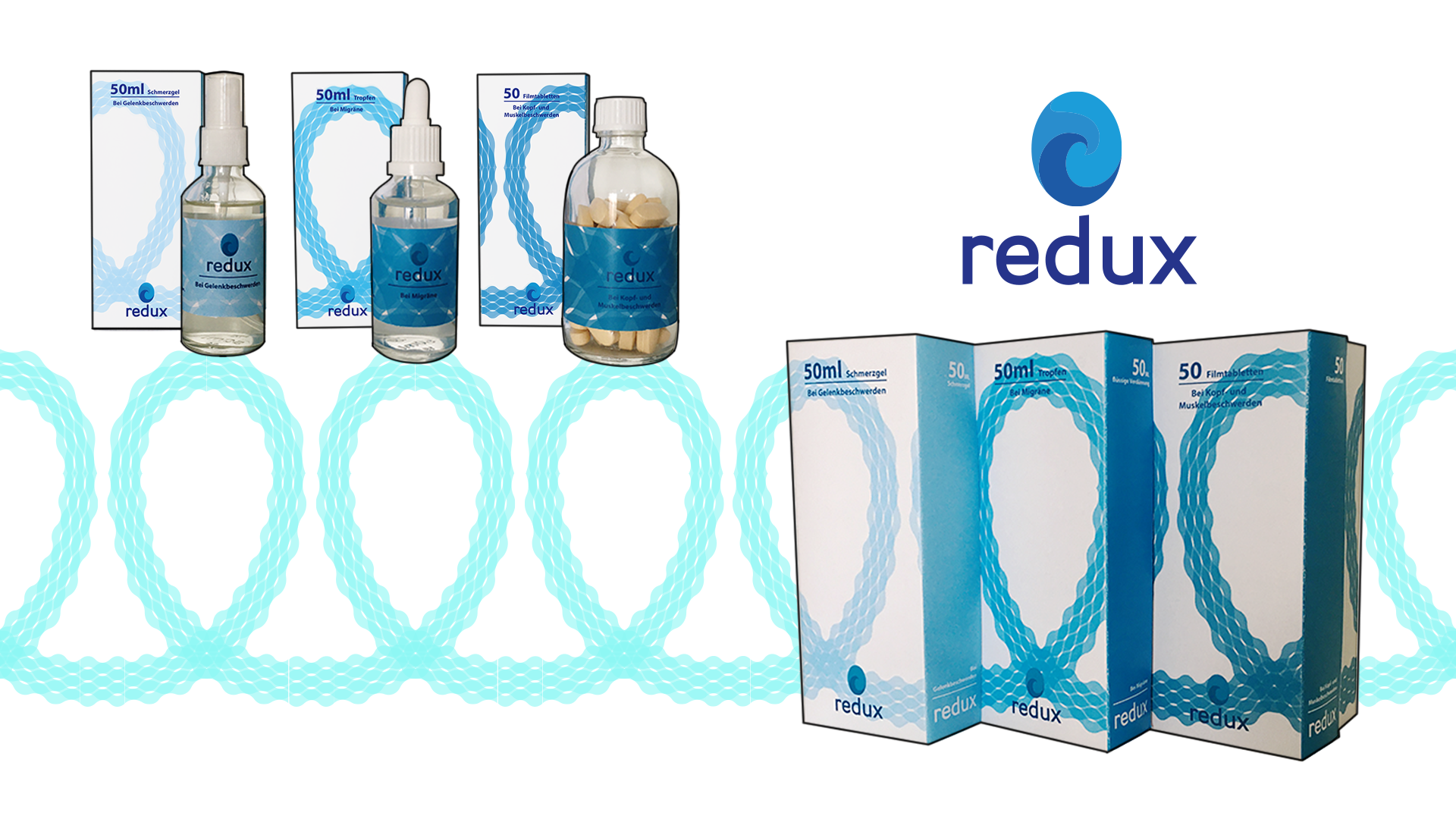
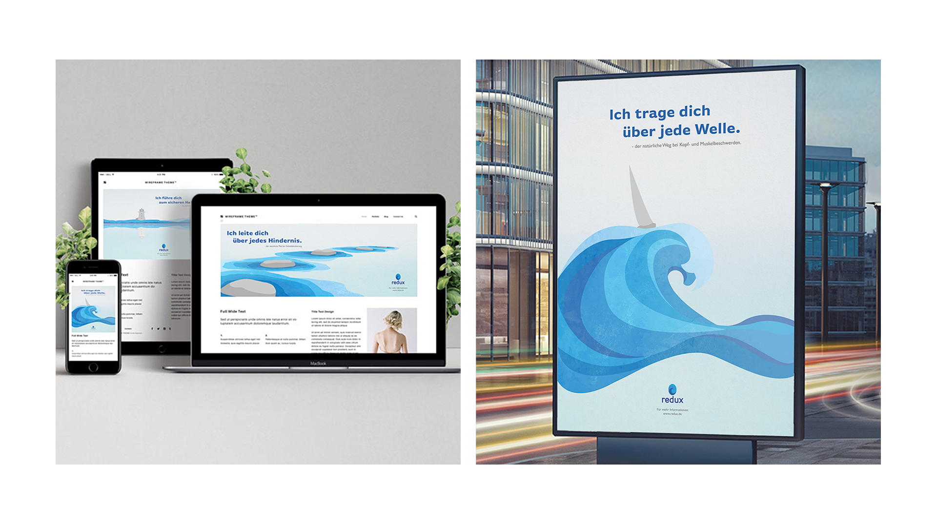
Mit kräftigen Farben und einem Muster aus stilisierten Wellen wurden Schmerzmittel in Gel-, Tropfen- und Tablettenform gekleidet. Mit einer Kampagne die zwar auf das eigentliche Produkt verzichtet, aber eine Weiterentwicklung der Verpackung ist, wird eine klare Message kommuniziert.
Created in the summer semester 2020 as a midterm project at the Academy for Illustration and Design Berlin.
The goal was to create a word-image-brand, package design and campaign for a fictional painkiller of the company REDUX. Designed for the target audience of Best Agers in a modern and noble design, with sustainability, natural content and the destigmatization of medicines as USP.
With bold colors and a pattern of stylized waves, painkillers were dressed in gel, drop and tablet form. A clear message is communicated with a campaign that does without the actual product, but is a further development of the packaging.